The following is an example of a process map we reviewed and improved for a large government funded organisation. This process map has many failings, but we review this to show you what those technical failings mean to someone trying to use the process map.
The following is the map provided, but we have changed some of the names to protect the customer’s identity. In fairness to the customer, they were asking us to review the process as they knew it could be improved. What we liked about it was it was such a nice simple example showing many failings that we could use as an example.

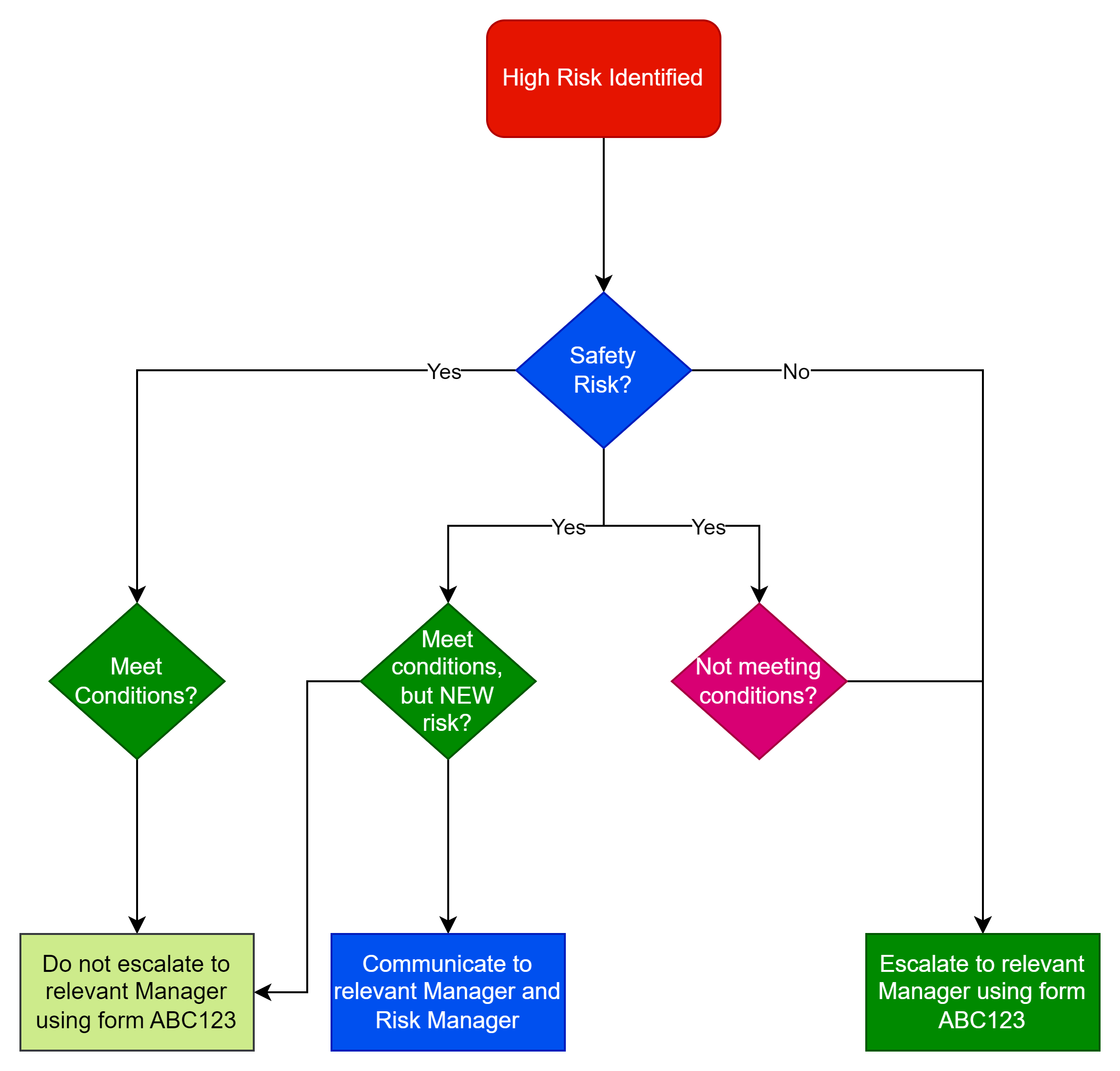
What does it mean?
This map helps to represent the process of managing high risks in the organisation, keeping records of determinations and escalating only where they meet certain conditions.
Process map symbols
The red lozenge at the beginning shows the start of the process when a high risk is identified. The diamond shaped symbols are decision points with arrows showing the various decision options available at that decision point. The rectangular boxes are process steps. In this case they are the steps to take following the decision.
What’s wrong with the map?
So what’s wrong with the above process map?
- The start and end of a process are typically defined by a lozenge or circle so we have one at the start, but not one at the end (or ends).
- You should always have at least two options coming from a decision point, otherwise there is no decision to make.
- Any documents referred to should be shown in their own icon so that it’s clear there is a document.
- Every branch from a decision point should have its own unique identifier (e.g. Yes, No, etc)
- The decision points should be minimised and not be duplicated except where absolutely necessary.
How does that create a problem process?
The first problem is if it’s a safety risk which of the three Yes branches do you take? Then when if its a new Risk we don’t know whether we should be Communicating to the relevant Manager and Risk Manager or just filling in the Risk Notification form.
If your process is ambiguous then some people will take the incorrect steps. If the process isn’t easy to follow people just won’t bother. Instead, they’ll take time asking others what they should do and possibly be ill advised (wasting more time).
If you mess up a simple process map like this, chances are you will never manage to appropriately document a complex process.
Process Intent
The actual intent of the process was to have three possible outcomes based on the following conditions:
- Communicate to the relevant Manager and Risk Manager – if it’s a New Safety Risk meeting XYZ Conditions
- Escalate to the relevant manager – if it’s not a Safety Risk or its a Safety Risk not meeting XYZ Conditions
- No Action – if it’s a Safety Risk meeting XYZ Conditions
And the Notification Form was only required where it wasn’t a NEW Risk.
What the process map should look like
The following shows what the process should look like. It draws out the document used, has two labelled conditions from every decision point and ends in one of three outcomes. You can trace through from the start to the end.

Even more process improvements
Even this simplified process can be further improved – see below for some examples:
- The process that leads to the High Risks being identified should be referenced.
- Responsibilities could be better identified.
- The conditions referenced by the decision point should be cross-referenced.
- There is little point to the colours used in the process steps. These should be removed or used to show something such as responsibility, process step risk.
- Related documents could be hyperlinked.